 Over the years we’ve run across some things that would flat out blow the average mind and make you shake your head in disbelief.
Like many have said in the past, it’s the version you create that you like the least, put the least amount of time in, that actually out performs what you thought was your masterpiece.
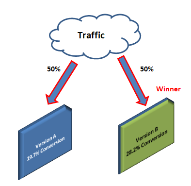
Don’t take anything I say here as a standard because I can assure you that your market will respond differently. The only way you’ll discover what works best is by split testing landing pages you create against each other.
We manage an older packaging supply site that has a 10 step checkout process that in my opinion should cost them orders, however just the opposite occurs.
For people that enter the funnel 28.31% of them convert to a sale.
A few years back I personally worked on a site that did automotive classifieds – let’s face it there’s only 2 paths you can take on a site like that – you’re looking to sell a car or buy one.
The home page handled this, but it gave visitors entirely too many ways to accomplish this simple task. It did well, but not nearly as well as a test where we sent all of the non-cookied visits to a page that only gave you two options and each of those lead to a form to collect at least name email and phone number.
That test more than doubled lead volume. Basically it was a similar to your typical paid type dating site where you have to opt in to go any further in the process.
While it may have turned away some visitors, it took total leads from 8,000 to more than 20,000 a month.
Since their money was made in a call center you can see this could have been a very profitable model.
It’s another great example; if we weren’t testing this out on a small segment of traffic initially we would have never discovered it.
These are just a couple of odd examples of A/B tests and why you should always be testing everything you do online and off.
If you’re looking for assistance with your testing or online marketing contact us today to take your website to the next level.