By Tom Deutsch, VP Creative Services at InteractOne
The word “simple” can be a little deceptive. For eCommerce sites, conversion is the ruling metric. So, simplification is a tactic that you HOPE will give you better conversion.
Often, what we describe as simplification is not achieved by removing content from the page. Instead, site simplification uses UI design principles to focus and compartmentalize shopper activity.
Google is not strictly an eCommerce site, but it is the most-offered example of simplicity.
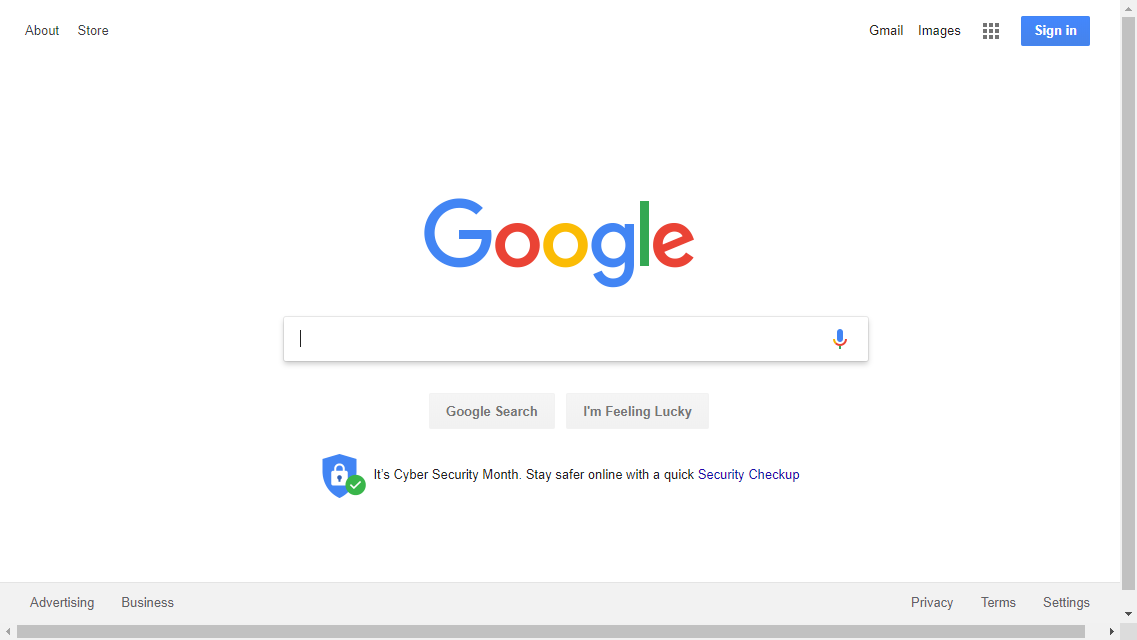
On the first impression, this baby is zen. You know exactly what to do here, not only because you’ve seen it a million times, but because it is obvious the first time you see it.
Really though – just like on your site – there is a lot going on here.
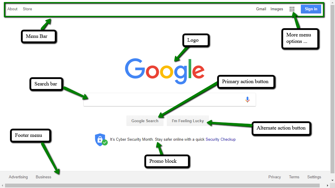
Given these requirements, Google could easily have looked something like this:
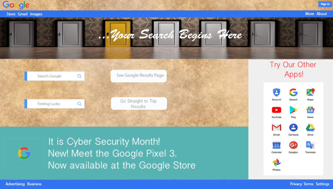
Simple looks easy, but it’s obviously not. As the illustration shows, how a given set of content is formatted and arranged can result in brilliance or an uninspired mess. Obviously, you and I don’t have Google’s resources, but we can take some lessons from the example.
Conquer the impulse to decorate
Communicating your visual brand doesn’t require elbowing aside the eCommerce path to purchase. For example, Magento’s default theme provides for an image at the top of each category. Key to remember – it is optional.
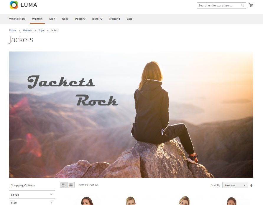
Designers can and do use banners to display beautiful and inspirational images and promotion reminders. In most cases, they are a distraction or an obstacle. They push the products down the page and are literally in the way, whether the user landed here directly or via navigation. Category pages are high-shopping intent; let the people shop! One innovative idea is to package small promotional blocks within the product grid, as seen on Lush:

Another source of clutter included in most eCommerce themes is the sidebar, which often says to the shopper: “you probably don’t want what is on this page; here’s another thought.” Think carefully before including sidebar elements, which do not translate readily to mobile, anyway.
Background textures, colored text, underlining, too many control elements (arrows, buttons and open fields) can stress out your page visitor, often evidenced as increased bounce rates. Use control elements extremely selectively and they’ll provide prominent and effective visual direction for your visitors.

Don’t fear the click
In your home, clothes would be easier to pick out if they were carefully arranged by color on the floor. Will you stop wearing clothes if they are put in a drawer instead? On your website, there are many categories, tools, features, and benefits all competing for attention. It is tempting to use the flexibility of a web page to find places to display all of them. That is designing by fear – thinking the shopper will not click to explore. Instead, set filters to closed by default. Place content in collapsing divs, dropdowns or tabs.
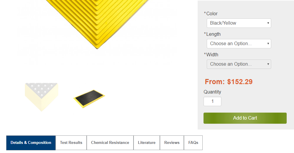
Matsonline.com has a complex product configuration and extensive product documentation, but with a well-managed UI, the goal of the page is still clear.
Think of your shopping pages not as billboards or directories, but as a neatly organized and well-labeled closet. Present a confident, simple and intuitive experience and trust the shopper to shop – that’s what they came to do!
Plan to succeed
To get simple, think integrated. Focus heavily on the things that spur conversion in eCommerce: Blazing fast page load, intuitive user interface, high-quality product images, authentic reviews, high-authority links. When those essential elements are in place, then your site will have the freedom to shed or reduce the emphasis on promotional content, memberships, forums and offers better suited to ads and social media.
The primary technique for maximizing simplicity is something you’ve often heard but is not often practiced: Mobile first design. Designing for desktop usually means you are starting with a grand and polished vision of a home page – that usually gets marked up and appended by numerous well-meaning hands. Designing for mobile forces discipline on your requirements. The best mobile sites behave like a guided tour – with each landing page focused on one thing and branching out from there, presenting choices in clear and manageable chunks. A desktop site that looks and functions like a mobile site is far preferable to a mobile site that looks like a squished and peeled version of a desktop site.
Your website will reflect the state of your business. Clutter within the business will produce clutter on the website. Simplicity breaks down when complex features are tacked on to the middle or end of a project, or if internal buy-in of the requirements was not secured up front. Whether embarking on a new eCommerce site build or revamping an existing one, have a specific plan. Know your requirements and make sure your platform can fill them without major customization. Pick designers and programmers you trust, then let them guide you to achieving a simple, user-friendly, high-converting site.
If you would like assistance with streamlining or otherwise improving the user interface of your eCommerce site, please feel to connect with our team. We’d be happy to lend a hand.