What is the Best eCommerce Platform for My Automotive Accessories Site?

What is the Best eCommerce Platform for My Automotive Accessories Site?

Selling auto parts and accessories requires a platform that can handle a complex database, even if you don’t adhere to ACES/PIES. Year/Make/Model lookup is just the start since some parts are universal and other parts might fit a subsection of vehicles. Platform choice touches on many big questions that you will need to consider: How important is your current branding? Do you have brick and mortar retail locations? Do you have dealer rates, regional restrictions, or installer relationships to factor in? What about legacy system integrations?


Auto-specific eCommerce Providers

An automotive-focused platform can sometimes be a great fit, sometimes not.

The Pros:

  • Built to handle make, model, year and cross-referenced fitment.
  • Provides a design template that accommodates part and fitment lookup.
  • If no customization is needed, and you like the design and functions, then cost of ownership can be lower than with a more full-featured platform like Magento.

The Cons:

  • Pre-packaged, custom themes don’t offer much design flexibility.
  • Coding practices can be questionable and can lead to bugs and glitches as new versions of supporting technology conflict with the themes.
  • Most of the solutions available are older technology and closed environments, with little to no option to add custom features.
  • Similarly, pre-customized themes or platforms can make it difficult to adapt the site to the needs of the business. In fact, often you’ll need to adapt your business practices and selling ability to the capabilities of the site.
  • Most options are a shared shopping cart solution, so you have all the same features and functionality as everyone else on that platform, making it hard to find a competitive advantage.

Our Take:

Auto-specific eCommerce platforms provide an industry-targeted viewpoint that is helpful when creating a small, niche online store. However, we’ve found that these platforms often silo your growth, constrain personalization and limit brand flexibility.


Saas Platforms Like Shopify or BigCommerce

In contrast to Magento Open Source and Commerce, Shopify and BigCommerce take care of site hosting for merchants. These platforms target merchants who lack design experience and need an easy-to-use website builder. Smaller or niche merchants can find great success on these platforms, although automotive eCommerce stores still require some level of customization or add-ons.

The Pros:

  • No design experience is needed.
  • There is a consistent cost profile, month to month.
  • Software patches are included in fees.
  • It is easier to administer.

The Cons:

  • Apps available for popular customizations like year, make, and model may require customization, which can get expensive, and development options are limited to the module developer.
  • There are ongoing annual or monthly fees – whether or not you are making changes.
  • You don’t own your own website.
  • SAAS platforms do not support large catalogs (500K+ SKUs), and Enterprise-level versions can become very expensive compared to the base-level fees.
  • Some desirable features, such as faceted navigation or additional product attributes, aren’t available out of the box.

Our Take:

It comes down to your current scale and your growth expectations. SAAS platforms can be the right answer until you outgrow them or until you decide you need some site customizations. Still, Shopify, in particular, has become more flexible (for a SAAS) and can handle a surprising amount of traffic and level of transactions.


Magento

Magento is the most widely-installed and one of the most respected platforms in the eCommerce community. We have been a Magento partner since 2008 and have experience building automotive eCommerce sites on Magento. We know it really well.

The Pros:

  • Magento sites are highly customizable and functionality can be added via extensions.
  • Certain features (like back-end data integration with a PIM or some sort of advanced order management or keeping track of selected vehicles) aren’t available on Shopify or are harder to configure than on Magento.
  • You own the site and can migrate to another platform (if needed) with less cost and hassle.
  • You are able to choose development and hosting partners that best suit your needs and budget.
  • You have the ability to evolve the functionality on your site as need demands and budget allows.

The Cons:

  • The ongoing cost of ownership is higher than it would be on SaaS or auto-specific platforms so merchants who plan to achieve at least $2 to $3 million in sales may want to consider other paths.
  • Concerns and costs go hand in hand with managing site security, hosting, and ownership of your website code.

Our Take:

Overall, one of the greatest things about Magento is the ability to grow as your business grows. The fact that Magento is an open-source platform allows you to start with more basic features and capabilities than SaaS or auto-specific platforms (such as product attributes and the ability to use any payment gateway you wish) as well as a great design, and then the ability to continually add new features as your site grows. The site is entirely yours and the platform is a great fit for merchants who desire growth and flexibility above all else. Cost of ownership out of the box is higher, but if you want to evolve a site on a solid platform that will grow over time and add features as budget allows, Magento is a great choice.

Want to Learn More?

If this article has piqued your interest and you’d like to learn more about alternatives for your business, please contact us to schedule a no-obligation discussion about your situation and what the best solution for your business might be.

How Mobile Use Has Affected SEO

How Mobile Use Has Affected SEO

Mobile Use SEO

Search engine optimization is the key to getting potential customers to see your brand when they search online. In the old days you just had to include a few keywords, but the rise of mobile devices has made it so people don’t search as much on desktop computers as they do on the phones they carry around. In fact, 3 out of every 5 searches happen on mobile, so mobile far outpaces desktop as the number one method of searching. Though it may not seem like a huge difference, mobile search results are actually quite different from desktop search results.

People Don’t Click Like They Used To

Jumpshot Digital Intelligence recently gathered data on how many Google searches included organic clicks, ad clicks, and no clicks at all. Those statistics were then compared between mobile searches and desktop searches. When you look at the two sets of data side by side, there is a huge difference in the number of organic clicks on desktop vs on mobile devices. For desktop users, the change from 2016 to 2018 was nominal. However, mobile searches showed a much larger change, with an increase in no clicks (56.1 to 61.4 percent) and ad clicks (3.9 to 8.9 percent) while organic clicks showed a significant decrease (40.1 to 29.7 percent).

So the question is: why? When users search something related to shopping or a product, the first several results will be ads and possibly a carousel at the top with the products they’re looking for. Chances are users won’t scroll past that to see any of the natural search listings.

The other problem is with informational searches, which often get filled with Google’s own answer box for direct questions as well as ads and embedded YouTube videos related to the question asked. On a desktop monitor with a larger screen, you may be able to see past the layer of ads and answer boxes, but users on mobile devices are commonly looking for instant answers, so the first few results commonly grab their attention first. So, how can you get around that to ensure you’re properly targeting searchers?

Step Up Your Game

Though it may seem intimidating to be competing with paid ads, there will always be value in optimizing content and technology to target searchers. There are a few ways to improve your search rankings that don’t include spending money on Google Ads.

Win the Answer Box

Getting into the answer box guarantees that you’re the first thing that users will see in their search results, and also ensures that you will be the first thing they hear if using voice search.

Get Cracking on Informational Content

Most searches on mobile devices are informational. Additionally, as seen above, most mobile search-result clicks go to an ad, or garner no clicks at all. Therefore, adding informational content to your site will result in more visits to your site.  

Establish Authority

The same informational content that gets you more clicks also boosts your authority. Quality content will sometimes be shared, and that improves your chances of being featured in someone else’s blog or social media posts.The authority obtained from these actions is critical to winning the coveted and necessary first organic listings, which are now commonly in the middle of the page (immediately following the ads and answer boxes).

Mobile Optimization is Crucial

If you can get people to come to your site, you don’t want them immediately leaving due to poor layout or slow load times. Ensure that your site has been tested on mobile devices and so that you are in the best position possible to shrink the mobile visit-to-conversion gap.

Be in the Top 3

In the end, you should at least be aiming to be in the top three positions on search results. Once users find what they’re looking for, they’re not going to search anymore, so you have to be the search result that gives them what they’re looking for. If you’re looking for more information or need assistance with SEO, contact us today.

Transforming Your B2B Landing Pages to Unlock New Leads

Transforming Your B2B Landing Pages to Unlock New Leads

B2B Landing Page

While B2B eCommerce has rapidly grown and evolved in recent years, one trend remains the same: successful landing pages are often the key to capturing leads. Business-to-business (B2B) sales can be trickier than business-to-consumer (B2C) sales because B2B sales typically involve complicated products, multiple stakeholders and a customer who may be wary about committing to a purchase. But this doesn’t mean B2B sales are impossible—it simply indicates that carefully developed landing pages are crucial to moving prospects down the path to purchase.

When creating landing pages, you need to remember that you’re not selling your product to just anyone. You have a target audience in mind, and you need to gain their contact information. With a good landing page, you can introduce your product to your target audience and also potentially get their contact information by offering something of value such as a white paper and a contact form.

To get the most out of landing pages, you can’t put just anything on them. You need a strategy in order to optimize these pages so that they are as effective as possible. Here are a few strategies you can use:

Focus on the Content

Start with the purpose of the page, then curate content to fit that purpose. This might be your only chance to draw someone in, so you need to get your message across instantly. A bold headline, strong subheading, and powerful call-to-action is the perfect combination to entice site visitors from the start.

Ultimately, the goal of a landing page is to walk the customer through the purchase process. Build brand awareness by giving a general overview of the company’s services or products, discuss the features and benefits, and then drive conversions by adding a call-to-action or contact form that makes them click. Additionally, include anchor navigation so the page appears more digestible. This could be in the form of a menu or drop down that follows the visitor as they scroll through the page.

Triple check the content to make sure there are no typos, then send it to another member of your team and have them look it over and add their perspective. If you’re not a great writer, consider hiring someone to do it for you. Writing a great landing page is about clearly communicating the benefits of the product or service, and formatting it in a pleasing, digestible way.

Keep it Simpleand Get to the Point

One mistake that some merchants make with their landing pages is trying to do too much. According to Nielsen Norman Group, 57% of visitors’ time spent on a page occurs above the fold (and 74% is spent on the first two screenfuls). If every single statistic about the services or products are included, not only will it overwhelm website visitors, but they’ll give up and leave the site without getting a clear picture of who the brand is and what they do. When creating a landing page, focus on the most important aspects of the product/service, and then use that critical information to develop the page layout. Be sure to keep it simple—a headline, visuals, copy, lead form, and call-to-action. B2B customers want clear explanations and answers in the least amount of words possible. Remember, the goal is not to close the deal, but to gain their permission to continue the discussion.

Make Use of Images and Videos

When creating a landing page, make sure it is not simply a large wall of text. A great way to change things up is to include relevant images, charts and videos. According to MDG Advertising, 67% of online shoppers rated high quality images as being “very important” to their purchase decision. With that kind of importance, be sure the images you are using are of high quality and, if possible, avoid cheesy stock images. To do this, consider subscribing to a reputable stock photography service such as Shutterstock.

Videos are a great way to lengthen the time that visitors are on the site, and can sometimes convey more information about the brand than text can. If including a video on the landing page, make sure the thumbnail is visually compelling and well-aligned with the content. If there is no thumbnail or the thumbnail is uninteresting, prospects won’t click. Also, be sure to either include some sort of wrap-up for the video or consider adding the video script beneath it. If they don’t have access to headphones, don’t have time to watch a video, or something else, make sure they won’t miss the main message.

Split Test

Finally, it’s hard to know if the content on the landing page is going to be effective. This is why split testing and tracking the results is vital. Split testing works like this: create two versions of the landing page, with differences in content and presentation. When someone enters the landing page, they are randomly shown one of the two versions. By tracking the results of each page, you can see over time which version performs better. Then apply what you’ve learned, and repeat the process making  changes and testing some more.

Always Look for Ways to Improve

The key to optimizing B2B landing pages is to always look for ways they can be improved. Sometimes, small changes like adjusting your title, adding in some more images, or changing the call-to-action results in tremendous results. If you need assistance with your B2B eCommerce site or are looking to polish your landing pages, contact us today.

Mobile Checkout: From A Pain Point to an Opportunity

Mobile Checkout: From A Pain Point to an Opportunity

mobile checkout
As more and more people are using their phones to access the Internet, and do their shopping, a mobile-first strategy has become more important than ever. eCommerce is all about convenience, and for many years, many merchants struggled to conceptualize an efficient, streamlined checkout process that converted customers rather than sending them away.

One of the goals for every business is to eliminate the path-to-purchase pain points of your customers. For mobile-checkout, it’s crucial to analyze these pain points and quickly correct them before customers turn to your competitors to satisfy their needs.

Why Mobile Checkout is a Pain for Both You and Your Customers

Mobile checkout isn’t just a pain point for your customers, it’s also a headache for the merchant. There is a lot of thought that goes into creating a checkout system: which shopping cart software to use, how to handle credit card processing, and how to track and ship orders. Even if you manage to navigate through these waters and provide your customers with a usable mobile checkout process, it’s not always the best it can be.

Perhaps a customer reaches the checkout process and they find that it loads incredibly slowly. Or, they see that the forms they are required to fill out are lengthy and complicated. Maybe they make a mistake, and they can’t figure out how to go back or reverse their mistake. There are plenty of problems that a customer can face with the mobile checkout system, and each one can cause the customer to abandon the cart.

How to Fix Your Pain Points

Luckily, once you identify the issues in your shopping cart, it isn’t too hard to improve your mobile checkout experience and turn it into an asset for your business.

A good first step is to add a simple progress bar at the top of the checkout window to help assure customers that the process is not too long.

Additionally, you can implement an auto-complete feature for the mobile checkout. This will save your customers some time by auto-filling some of their information and will most often save customers the hassle of typing on a small screen with an even smaller keyboard.

Finally, make sure you add a final confirmation page to the end of your mobile checkout process, if you don’t already have one. This will allow your customers to review the items in their cart, make sure they input the correct payment and shipping information, and be reminded of how much they’re being charged. This significantly reduces the chance of customer complaints about their order or payment method.

Turn Your Pain Point into an Asset

If you can make some small changes to your mobile checkout process, it will produce large results. Suddenly, something that was driving customers away is now bringing them back. Customers love it when they are able to easily use a website from their phone, especially when it comes to buying something.

If you’d like to find out more about how you can improve your mobile checkout process or embrace mobile-first strategy, please feel free to contact us at any time.

How to Keep Your Magento 2 Site Simple

How to Keep Your Magento 2 Site Simple

Magento 2 Simple

As Magento 1 end of life draws near, we are receiving a lot of buzz from potential clients who are considering taking the plunge and diving headfirst into a Magento 2 site migration. As we go through the project scoping process for these potential customers, we have noticed a recurring theme that we feel we should address: over-customization and the overuse of extensions are the silent killers of countless Magento sites.

What’s important to understand about customizations and extensions is thatwhile in theory, they seem beneficialthey are often hindering the success of your site. We are finding many small and medium-sized (SMB) merchants that have sixty plus extensions and ten customizations, plus core hacks, on Magento 1. These merchants are forfeiting much of their budget that they should be spending on digital marketing just to keep their unstable Magento site running. Also, this over-customization is causing site-load and other performance issues which hurts SEO and overall user experience.

We must also note that some merchants who have migrated from Magento to a SaaS platform are performing much better than they were on Magento. We have been perfectly transparent about this when scoping projects for potential customers. Magento is powerful and a great fit for many, but not for all.

With Saas platforms, customization is harder and the monthly cost for 3rd party apps makes it easier to understand the long term budget ramificationswhich, as we are realizing, is actually a blessing in disguise for merchants who are prone to overload their site with every new feature that comes along. This is why a lot of the time these platforms are working better for SMB merchants; in many ways, Saas platforms limit the ability for the merchant to over-customize and over-complicate the eCommerce experience.

As we work with new prospects on migrating to Magento 2, we are trying to help them limit the number of customizations and extensions they are using. We start by taking a step back to rethink the actual business processthis means asking the hard questions like, “Is this customization really needed? Do you really need an ajax add-to-cart extension? Quick shop? Quick view?” Do these added features really justify the long term maintenance expense? The answer is most often not.

Magento 2 has all of the tools that most SMB merchants need to provide a great shopping experience: product video, shopping experience and payment options. The M2 theme is optimized for the shopping experience, so merchants don’t need to invest much in an overly-customized user interface. For SMB merchants migrating to Magento 2, we recommend leaving out “the nice to have” features and instead focusing on the minimum viable product. See how the site performs for a few months and then ultimately decide which features to add. You might be amazed to find that you have improved SEO and site conversions just by using the out-of-the-box features included with Magento 2. Paring everything back and avoiding unnecessary customizations may be the greatest improvement a Magento merchant can make.

If you are finding yourself with a site that is over-customized and over-complicated, contact us today or visit us at interactone.com. We can help.

How to Optimize eCommerce Shipping and Fulfillment

How to Optimize eCommerce Shipping and Fulfillment

shipping and fulfillment

Your eCommerce shipping strategy can make or break your business. As eCommerce revenue has increased and online shopping has flourished, shoppers have upped their standards for shipping speed and price. Amazon Prime set the standard for shipping policies with their free two-day shipping—this means today’s consumers expect a similar service. If you aren’t meeting their expectations, another competitor (like Amazon) will.

A 2018 study conducted by Pitney Bowes found that over 50 percent of online consumers were disappointed with the shipping and fulfillment service they received last holiday season. With so much dissatisfaction in a very competitive marketplace, there is a ton of opportunity for eCommerce merchants to increase their sales and customer base by providing stellar shipping and fulfillment services. So, how can merchants accomplish this?

Have Clear and Accurate Policies

The name of the game when it comes to eCommerce is convenience for the consumer. Consumers like to shop online because it is easy. However, online shopping can be risky for two reasons: customers can’t see the product before they buy (besides a few photos), and they don’t know if the product will arrive at their address safely and in good condition. Clearly stating the shipping and return policies on your website is the best way to build strong consumer confidence. If they are confident in the services being offered to them, they are far more likely to buy rather than abandon their shopping cart.

Offer Free Shipping

eCommerce is a competitive market. To gain a leg up on the competition, consider offering free shipping, if your business model will allow it. In the same 2018 Pitney Bowes Study, researchers found that over 90 percent of consumers said they would abandon their carts and leave a website that did not offer fast and free shipping.  Although a huge deciding factor in the customer’s decision-making process is the shipping price, the speed of delivery greatly matters as well. If possible, add an estimated delivery date (EDD) to product and shopping cart pages to put last-minute shoppers at ease.

Be Aware of Shipping Changes for 2019

Each year, shipping carriers review their pricing and make adjustments to their shipping rates depending on the economy, fuel costs, and industry demands. 2019 is no exception. USPS, UPS, and DHL Express in the US have increased shipping rates for 2019be sure you factor in these changes when planning out your shipping strategy for the year. Here’s a breakdown:

  • UPS (Effective December 26th, 2018): UPS Ground will increase by an average of 5.2%, UPS 2nd Day Air will increase by an average of 7.2%, and UPS Standard (to Canada) will increase by an average of 1.8%.
  • USPS (Effective January 27th, 2019): First-Class Package Service will change to zone-based pricing. That means the cost to ship will be determined by both the weight of the package and its destination. Previously, the package weight solely indicated the cost.  Balloon pricing for Priority Mail will be eliminated. Balloon pricing previously applied for packages weighing up to 20 pounds with a size between 84 to 108 inches in combined length and girth when shipping to zones 1-4. Now, the actual weight will be the sole factor in deciding the price. And finally, First-Class Package International Service will increase by an average of 3.7%.
  • DHL Express in the US (Effective January 1st, 2019): Retail prices will increase by an average of 5.1% for their DHL Express Worldwide shipping service.

What ShipperHQ Can Do for Shipping

ShipperHQ, the world’s #1 storefront shipping management software, provides eCommerce merchants with the tools necessary to streamline the shipping and fulfillment process. With the power of ShipperHQ, eCommerce merchants can:

  • Surcharge or discount your live and custom rates
  • Set rules or restrictions based on conditions like geographic zones, specific products, and price, weight, or quantity filters
  • Hide specific rates on conditions you choose
  • Set promotions for a specific range of time
  • Ship products from multiple warehouses or dropship vendors
  • Ship products that need to be delivered on a certain day
  • Set max time in transit for certain items so you can deliver perishable goods

*ShipperHQ is compatible with Magento 1 & 2, Woocommerce, Shopify, and Zoey.

Let’s Talk Shipping

In the competitive online marketplace, there is a ton of opportunity when it comes to providing high-quality shipping and fulfillment service. Contact us to learn what the power of Magento can do for eCommerce merchants everywhere.

What Are Successful Auto eCommerce Merchants Doing to Stay on Top?

What Are Successful Auto eCommerce Merchants Doing to Stay on Top?

auto eCommerce

2018 marked massive growth of Automotive eCommerce and merchants, as they are now selling everything from parts, to accessories, to services for both B2B and B2C buyers. Automotive eCommerce is no longer a niche segment, it’s a rising standard.

As we enter 2019 and automotive eCommerce revenue continues to grow at an exponential rate, more and more merchants want to reap the benefits by launching their own websites. Expectations for these sites are high as competitors are improving their sites every day.

So how can new automotive sites compete with already established merchants? Following some of these basic rules is a great start.

Product Listings must be Clear, Visible, and Detailed

Automotive eCommerce shoppers tend to be passionate and well-informed. They know what they are looking for and if they can’t find it on your site, they will move to the next where they can. This is why proper SEO techniques and rich product content is crucial. This tactic will increase product visibility across browsers and marketplaces, improving a brand’s presence as well as offering a competitive edge.

To ensure visibility, be sure to include searchable keywords in the title, such as the manufacturer name, type of part, and the reference number. Craft detailed product descriptions and feature reviews beneath product to establish credibility and build trust. Also, be sure to include crystal clear, high-resolution images that allow for zooming in and enlarging (check out our Automotive Images Guide for more helpful tips).

Mobile Friendliness and Adaptability is Top Priority

In the modern world of eCommerce, a mobile-first strategy is required. Customers are shopping via iPhones, Tablets, Androids, Macs, and the list continues. When building a new eCommerce website, this type of functionality is imperative for success. Analyze how your site looks on all types of devices, and note any discrepancies or disabled functionalities.

Consider Offering Free Shipping

Though shipping can present an issue for automotive merchants (due to the size and weight of the products), many successful automotive merchants have found ways to offer free shipping. Whether that be after a minimum order threshold has been met, or as part of a promotional offer, it is something merchants should consider when analyzing their checkout process. High shipping costs are commonly the cause of abandoned carts – so if you can offer free shipping, even for a portion of your catalogue, you should.

Provide Value Through Kits and Bundles

Bundling allows merchants to sell more product while also satisfying customers. You can test out what products sell best with others, or offer a Buy One Get One (BOGO) promotion on certain products. Some merchants are including features such as “recommended products” or “related products” that appear beneath a product listing, to keep the customer enticed and buying more. The more buying options that are available to the customer, the faster they can make a purchase that is right for them.

Navigation Must Follow the Customer Experience

Navigation is crucial to automotive eCommerce because inventories tend to be extensive and associated with the make and model of certain vehicles. More often than not, site visitors won’t waste their time trying to encrypt confusing menus or unclear navigation. This presents a dilemma for merchants: how should your site be organized? Our main message is this: data should fit the customer experience— not the other way around. Consider how a customer actually shops, then construct a process that follows those steps. For more information on navigation for automotive eCommerce, check out this blog.

Allow Customers to Create Accounts

Encouraging customers to create accounts is a great way to improve the overall customer experience. It streamlines the checkout process because customers can save their billing information or quickly reorder something they previously purchased.

Additionally, because automotive eCommerce shoppers tend to be enthusiasts, allow them to gain points for their purchases or enroll them in some sort of reward system. It will build loyalty to your brand and provide an incentive for customers to continue shopping there.

Our Automotive eCommerce Experience

Our experience in the automotive eCommerce industry has given us insights into the challenges merchants face as well as the successful trends many are utilizing. If you need assistance with your automotive-focused eCommerce site or require help with marketing, contact us today.

2019’s 5 Biggest eCommerce Trends

2019’s 5 Biggest eCommerce Trends

eCommerce Trends

As technology continues to get better, so does the eCommerce shopping experience. Below are a few trends in the world of eCommerce that we are tracking in 2019:

1. Smaller Merchants Moving to SaaS Platforms

Just a few years ago, some Software as a Service (SaaS) eCommerce platforms were around but generally lacked the necessary tools and functionality to be full-featured and reliable enough for many eCommerce merchants to consider. Now, technology has evolved enough that SaaS is slowly becoming the new standard.

This year, more smaller eCommerce merchants are likely to make the switch to SaaS platforms for a variety of reasons. For one, this model makes for a much simpler process for small businesses to manage—merchants can access the entire platform via the web. SaaS platforms provide other benefits too, including faster (and typically automatic) site upgrades that are included in the monthly fee and the need for less in-house tech support since the provider managers the underlying platform. Additionally, some merchants who originally chose an open-source platform such as Magento years ago may decide to move over to a SaaS solution, rather than upgrade to Magento 2

2. Competitor Analysis, Redefined

Over the years, defining exactly what and who a competitor is has become more complex. There are: traditional product line (category) competitors, organic SEO competitors, paid listing and advertising competitors, market share competitors (think Amazon), and disruptive competitors that sell only the cutting-edge products that will potentially replace what are being sold today.

This means that when considering tactics on how to compete with other merchants, it is important to benchmark against them from that same tactical space. In 2019, the competitive landscape has shifted, and we have admittedly seen many retailers that haven’t been able to keep up. Often times this is due to having an incomplete or inaccurate picture of who a given merchant’s competition really is.

It’s even possible that the merchants stealing your market share aren’t the ones selling the same stuff as you but are actually in the same boat!

3. A Greater Focus on Capturing Channel & Third-Party Customers

From a trends point-of-view, Amazon, Google, and other third-party sellers are a double-edged sword for online retailers. Having products on Amazon can generate high-volume sales, but can also expose merchants to competitive scrutiny like price undercutting and extreme profit margin pressure.

To counteract this, merchants are now looking for ways to get customers to buy directly from them instead of through the third-party channel. This allows merchants to circumvent the extremely tight restrictions on package inclusions that third-party channels often enforce. Additionally, merchants are offering products and formats like bulk pricing on their site that aren’t offered elsewhere. This leads to better SEO and greater visibility while reducing dependence on third-party channels, both of which will make this a growing trend throughout 2019.

4. Emphasizing Delivery & Fulfillment Marketing

Thanks in large part to Amazon, the new delivery standard customers have come to expect is 2-day shipping. This has forced eCommerce merchants large and small to rethink their delivery and fulfillment strategies in order to compete. But don’t worry—there’s still a variety of ways to do so other than lightning-fast delivery.

Look for many companies to put a greater emphasis on their packaging styles this year. Instead of opting to send customers their product in typical brown-box packaging, eCommerce merchants are getting a leg up on the competition with more colorful, exciting designs. This trend allows merchants to further customize their customer’s experience as well as to differentiate themselves and stand out from other businesses.

eCommerce Trends

Additionally, more merchants have started including printed promo inclusions inside the packages they are sending. This promo can be anything from 20% off a customer’s next order to a free sample of another product. These inclusions can help assuage the low satisfaction a customer may feel in a delivery experience that takes longer than expected or can be used as just another way to keep customers satisfied.

5. Rethinking Page Layout

In an effort to simplify the customer path-to-purchase and overall user experience, many merchants have begun to completely rethink how their webstore is laid out. In a market as saturated as it is today, merchants know that they need better product photography, more unique product descriptions, and better filter options for customers to be happy on their website. 

Put simply, merchants are making the move to a simpler purchasing experience for their customers (which can be harder than you might think). Businesses that learn to make the purchase process simple will see greater conversions and greater customer satisfaction with the order experience.

2019: The Year to Try Something New

2019 is poised to be an exciting year with big changes in the world of eCommerce. These trends are currently helping shape the strategies of merchants both of a large and small scale. Want to talk about applying some of these techniques to your eCommerce business? Contact our team of experts today.

The 5 On-Site A/B Tests Your eCommerce Business Should Try

The 5 On-Site A/B Tests Your eCommerce Business Should Try

Ever wonder how a user experience change on your site would affect conversions, but afraid to wreck your existing customer path-to-purchase? In these cases, a tool like on-site A/B testing—a way to compare one template style to another—can be a valuable asset for businesses to utilize. Even better is that most eCommerce platforms have built-in features allowing merchants to A/B test relatively easily. (If your platform doesn’t, there are plenty of extensions available for testing, too). The A/B testing ideas listed below will help you understand what your customer’s preferences are when it comes to the layout of your website as well as what gets them to select and ultimately purchase a product. Whether you’ve just begun to look into the benefits of A/B testing and are ready to try it for the first time or you’re an expert looking for additional ways to tinker with your website, these tests will help you discover how to best present your website to your customers.

1. Showcase a Prominent Sales and Specials Section

Many online shoppers only end up making a purchase if an item is discounted or at a special price. Making it easier for these shoppers to find the items on sale on your website can be a great way to increase conversions. On your website’s homepage, consider adding a sales and specials section that highlights the best deals your website has and encourages customers to act fast before it expires.
Even if the “on-sale” sale section on your homepage only provides a link to the actual discount page, it still serves as a faster, more efficient way to point customers in the direction in which they may be already interested in heading.

2. Try a Wide-Appeal Products Section

If your homepage isn’t currently being utilized in a way that emphasizes your best-selling products, testing a section that does just this could be helpful. Be sure to include great, enlargeable product images with clear pricing. You can also encourage quick purchases by including an ‘add to cart’ button for each product being showcased.
Testing a best-selling products section is one of the most surefire ways to encourage purchases and increase conversions. Customers life to buy products they know other customers have bought.

3. Make the Search Bar More Prominent

If your website has a vast variety of products, chances are you likely already have an on-site search function in place. However, if that search function isn’t visible or prominent enough, customers may have a hard time using it. You may want to test out a different size or location for your website search bar to see if it makes a difference.
A well-located search bar can help your customers have an easier time locating the products they were looking for, leading to an increase in purchases made.

4. Display a Benefits Bar

If you’re looking to add a bit of an edge against the competition for your eCommerce business, consider showcasing your benefits at the top of the home page. Many companies using this feature to tout any current free delivery deals, discount codes, reviews, and loyalty programs.
If you decide to test out a benefits bar, make sure to include only the most important aspects that set your business apart for shoppers.

5. Live Chat Assistance

Nearly 44% of online shoppers report wishing they had live chat assistance in the middle of a recent purchase. If your business has the personnel bandwidth, try adding the feature to see if your conversions increase as a result of this quick assistance. Not only do chatboxes help with customer service and conversions, but they also serve as a means to build your brand and receive feedback (read more here).
Ideally, set up the live chat assistance feature as a widget that floats somewhere on the side of your website and that can be clicked on to expand. This way customers will be able to use the live chat whenever they need to.

Create a Better Website

These A/B test ideas should help you understand your shopper’s online habits better, allowing you to better cater to their preferences. We recommend rolling out these tests incrementally instead of all at once so you can truly measure how each feature is performing without overwhelming your shoppers with new additions. For any additional help crafting the best website experience possible, be sure to contact our team of experienced developers and solution specialists today.
The Automotive eCommerce Guide to Navigation and Images

The Automotive eCommerce Guide to Navigation and Images

automotive eCommerce
In order to construct a visually appealing Automotive eCommerce site that promotes a fluid customer experience, there are two important things to keep in mind: know your customer and keep it simple.

Those statements may seem obvious. Certainly you must identify your customer base, and of course, you shouldn’t over-complicate your site. As obvious as it may sound, many Automotive eCommerce sites get it wrong. Whether that is due to the considerable amount of data on the topic or simply the nature of the industry, here are some tips to help keep you above par.

The best converting Auto eCommerce sites are the ones that are easy to navigate. First, identify your niche. Then, cater your navigation to your specific customer. The biggest challenge is always the data.

Data Should Fit the Customer Experience – Not the Other Way Around

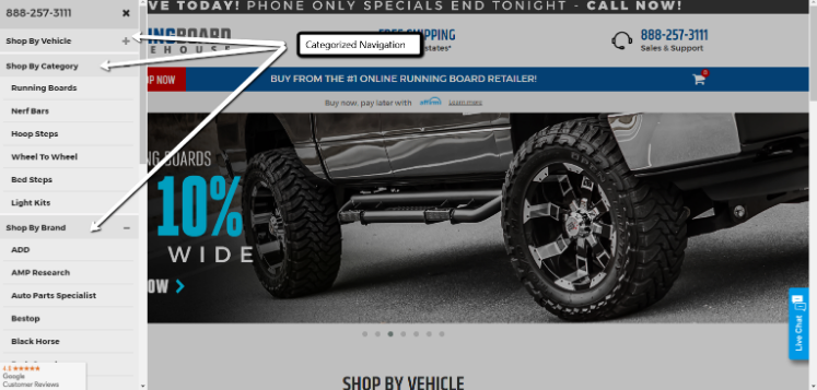
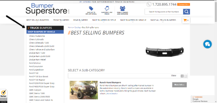
Data is arguably one of the most difficult aspects of Automotive eCommerce because it is extensive, complex, and ever-changing. Recent trends in the Automotive industry point to the year, make, model, and engine-filtered navigation. We have seen Auto eCommerce companies spend so much time, money, and effort simply integrating this functionality that they gloss over the issue of how a customer actually shops. The best automotive eCommerce sites are the ones that are extremely simple and easy to navigate with the ability to land customers on a very relevant and specific landing page. That’s very hard to do with the year, make, and model lookup. Our favorite (and the best converting) sites are the ones that utilize categorized navigation effectively, such as runningboardwarehouse.com and bumpersuperstore.com.


Running Board Warehouse separates their navigation into vehicle, category, and brand.


Bumper Superstore has multiple categories (including best selling, front and rear, style, vehicle, and all) that allow the customer to shop in a way that best suits their needs.

Make the user experience cater to how the customer shops – don’t try to cater the customer experience to the data. Because of data difficulties, merchants should start by identifying their niche (accessories, reused parts, etc.). Once they do, basing your site navigation and user experience around that specific niche will make fitting your data in that much easier.

Images Can Make or Break a Conversion

Automotive parts sites are often notorious for having either poor quality or catch-all representative images. Merchants that successfully convert prospects to customers generally take their own photos. Some do better than others, but having images that are detailed, bright, enlargeable, and vehicle-specific are more likely to resonate with customers. Nobody with a Dodge Ram wants to look at a Ford F-150 when shopping for aftermarket accessories – they want to know what the product is going to look like on their vehicle. Even though its a different industry, our work with Watson’s is very similar to what we’re discussing here.

Often times images are pushed to the back of the to-do list. But, if you’re selling online, you need actual photos of every individual part. When people are searching for a specific product online, they use their eyes to verify that they are purchasing the right thing. If there are basic filler images and customers receive a product that’s not right, they won’t trust you again. They need to be able to look at the picture and description and know that’s what they need.

Consistency is key, but lifestyle images should be incorporated into your site as well. If someone is searching for a tonneau cover, they want to see how to use it. They want inspiration – so inspire them to buy your products by showing them how to use the product and its various features. This can be done with images and video – don’t limit your team to just a photographer. Investing in video will pay off and help you inspire ideas and trust with customers. Incorporate videos onto your site with product demonstrations, installation how-to, Q&A, and customer testimonials.

Build a Community

Keep in mind that your customers are enthusiasts. Build a community around your brand with good content, social and email outreach/remarketing, or even some sort of rewards program. These days, when things are increasingly competitive in the auto industry, it’s a necessity to do more to engage your customers after their initial purchase. For additional help in building a strong customer following, check out one of our previous blogs on the topic. 

If you need assistance with your automotive eCommerce site, feel free to contact us today.