Ever wonder how a user experience change on your site would affect conversions, but afraid to wreck your existing customer path-to-purchase? In these cases, a tool like on-site A/B testing—a way to compare one template style to another—can be a valuable asset for businesses to utilize. Even better is that most eCommerce platforms have built-in features allowing merchants to A/B test relatively easily. (If your platform doesn’t, there are plenty of extensions available for testing, too).
The A/B testing ideas listed below will help you understand what your customer’s preferences are when it comes to the layout of your website as well as what gets them to select and ultimately purchase a product. Whether you’ve just begun to look into the benefits of A/B testing and are ready to try it for the first time or you’re an expert looking for additional ways to tinker with your website, these tests will help you discover how to best present your website to your customers.
1. Showcase a Prominent Sales and Specials Section
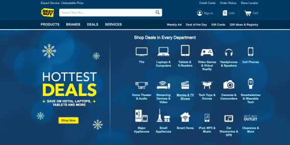
Many online shoppers only end up making a purchase if an item is discounted or at a special price. Making it easier for these shoppers to find the items on sale on your website can be a great way to increase conversions. On your website’s homepage, consider adding a sales and specials section that highlights the best deals your website has and encourages customers to act fast before it expires.
Even if the “on-sale” sale section on your homepage only provides a link to the actual discount page, it still serves as a faster, more efficient way to point customers in the direction in which they may be already interested in heading.
2. Try a Wide-Appeal Products Section
If your homepage isn’t currently being utilized in a way that emphasizes your best-selling products, testing a section that does just this could be helpful. Be sure to include great, enlargeable product images with clear pricing. You can also encourage quick purchases by including an ‘add to cart’ button for each product being showcased.
Testing a best-selling products section is one of the most surefire ways to encourage purchases and increase conversions. Customers life to buy products they know other customers have bought.
3. Make the Search Bar More Prominent
If your website has a vast variety of products, chances are you likely already have an on-site search function in place. However, if that search function isn’t visible or prominent enough, customers may have a hard time using it. You may want to test out a different size or location for your website search bar to see if it makes a difference.
A well-located search bar can help your customers have an easier time locating the products they were looking for, leading to an increase in purchases made.
4. Display a Benefits Bar
If you’re looking to add a bit of an edge against the competition for your eCommerce business, consider showcasing your benefits at the top of the home page. Many companies using this feature to tout any current free delivery deals, discount codes, reviews, and loyalty programs.
If you decide to test out a benefits bar, make sure to include only the most important aspects that set your business apart for shoppers.
5. Live Chat Assistance
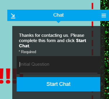
Nearly 44% of online shoppers report wishing they had live chat assistance in the middle of a recent purchase. If your business has the personnel bandwidth, try adding the feature to see if your conversions increase as a result of this quick assistance. Not only do chatboxes help with customer service and conversions, but they also serve as a means to build your brand and receive feedback (read more here).
Ideally, set up the live chat assistance feature as a widget that floats somewhere on the side of your website and that can be clicked on to expand. This way customers will be able to use the live chat whenever they need to.